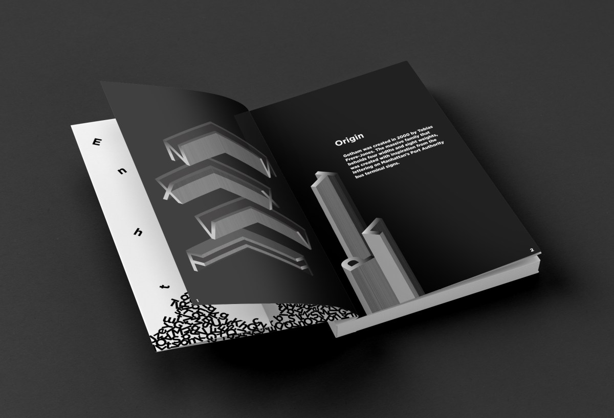
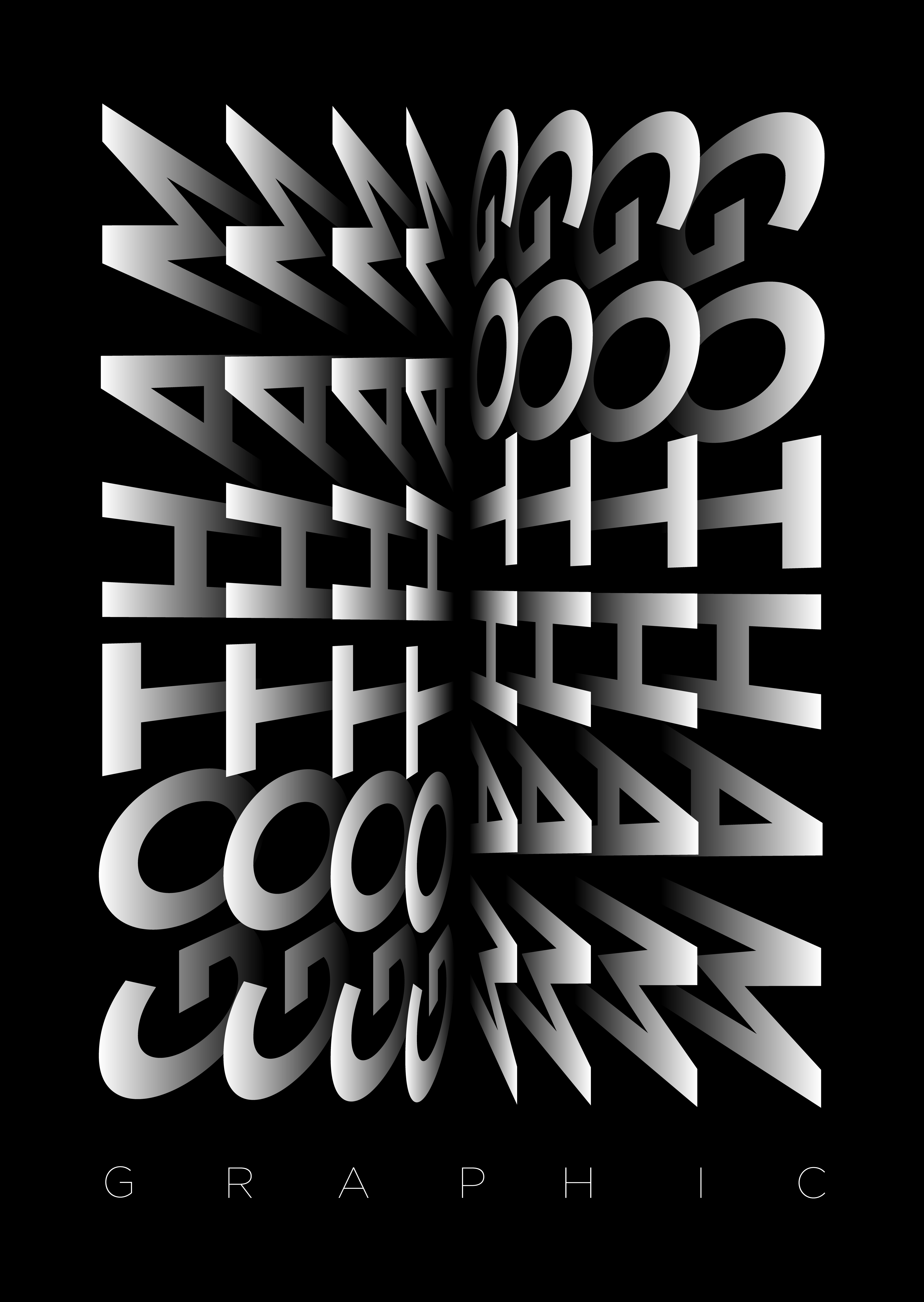
During my time in college, I completed a type-focused project centered around deeply exploring a single typeface. Tasked with researching and analyzing the visual qualities of a typeface beyond its function as a tool for communication, I chose Gotham for its bold, geometric clarity and contemporary presence. The result of this exploration was a self-designed book titled Gotham Graphic, which showcased the typeface not only in traditional forms but as a visual element used to build shape, form, and rhythm.
Throughout the process, I studied Gotham’s letterforms closely—its curves, terminals, proportions, and overall structure. This deep dive allowed me to break away from thinking of type as mere text and start viewing it as a system of shapes that can be reimagined and repurposed creatively. By treating the letterforms as design elements, I was able to craft abstract compositions, spatial experiments, and visual storytelling—all rooted in typographic form.


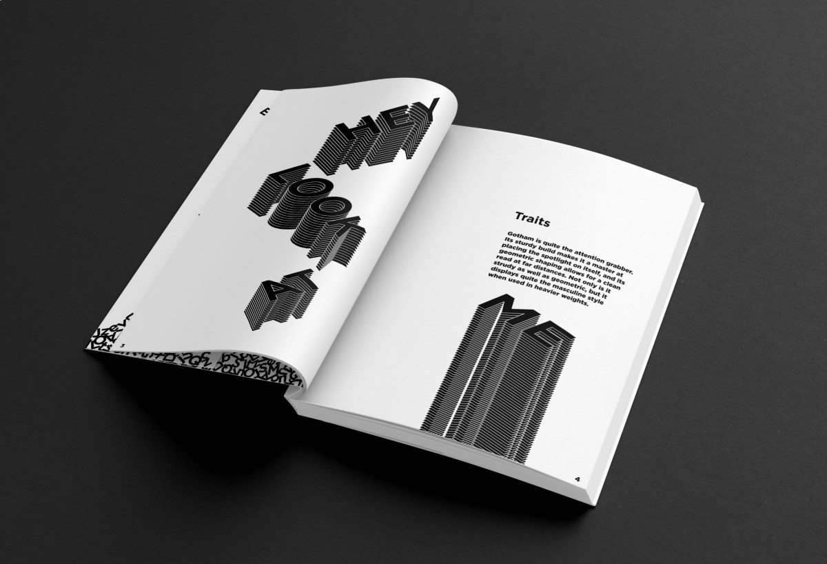
The project also pushed my understanding of type setting, allowing me to be playful with my designs, but at the same time encouraging me to create rules for myself. It also gave me a great opportunity in researching the book binding process.
This project helped me gain a more profound understanding of typography as both a technical and expressive medium. It challenged me to push the boundaries of how I use type in design, encouraging a mindset where typography becomes a central part of creative expression rather than just a vehicle for words.