During college, I challenged myself with a unique passion project that explored the world of package design through an unconventional lens: by removing color entirely. In an industry where packaging often relies heavily on bold hues and vibrant palettes to attract attention, I saw an opportunity to stand out by going in the opposite direction.
The packaging concept was designed specifically for coffee, inspired by my long-standing obsession with the drink itself. I wanted the visual personality of the brand to feel as rich and comforting as the coffee inside. What made this project especially rewarding was how it pushed me to think beyond the flat canvas of traditional graphic design. Translating my rubber hose illustrations onto a three-dimensional coffee bag meant every curve, fold, and angle had to be considered. The challenge wasn’t just creating engaging artwork—it was making sure that artwork could wrap, flex, and still tell a cohesive story across a physical, functional form. It taught me a lot about spatial design and how illustration can live and breathe on unconventional surfaces, not just screens or pages.
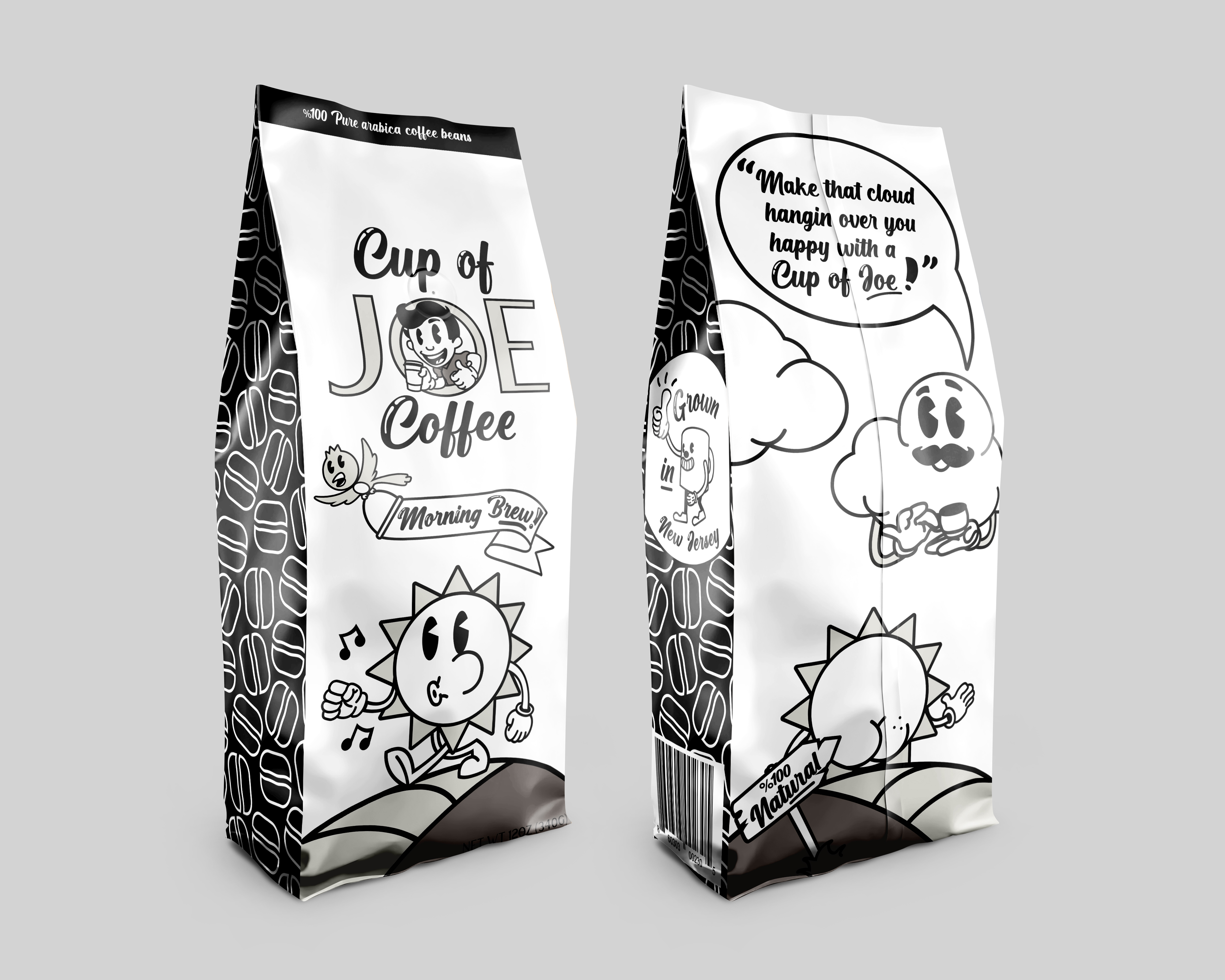
I focused on creating a package design concept that was entirely black and white, using the absence of color as a creative constraint. To bring life and charm to the design, I turned to rubber hose illustration, a style that emerged in 1920s animation and is known for its whimsical, bouncy characters with fluid, tube-like limbs. This vintage aesthetic gave the design a playful, nostalgic energy, while the limited color palette emphasized form, composition, and storytelling.