During college, I created a packaging design project centered around a fictional line of hot sauces called “Insomnia Hot Sauces”—a brand concept built on the idea that these sauces are so bold, they’ll keep you wide awake. This project became a turning point for me, as it allowed me to dive deep into two key areas of design I wanted to strengthen: branding systems and color theory.
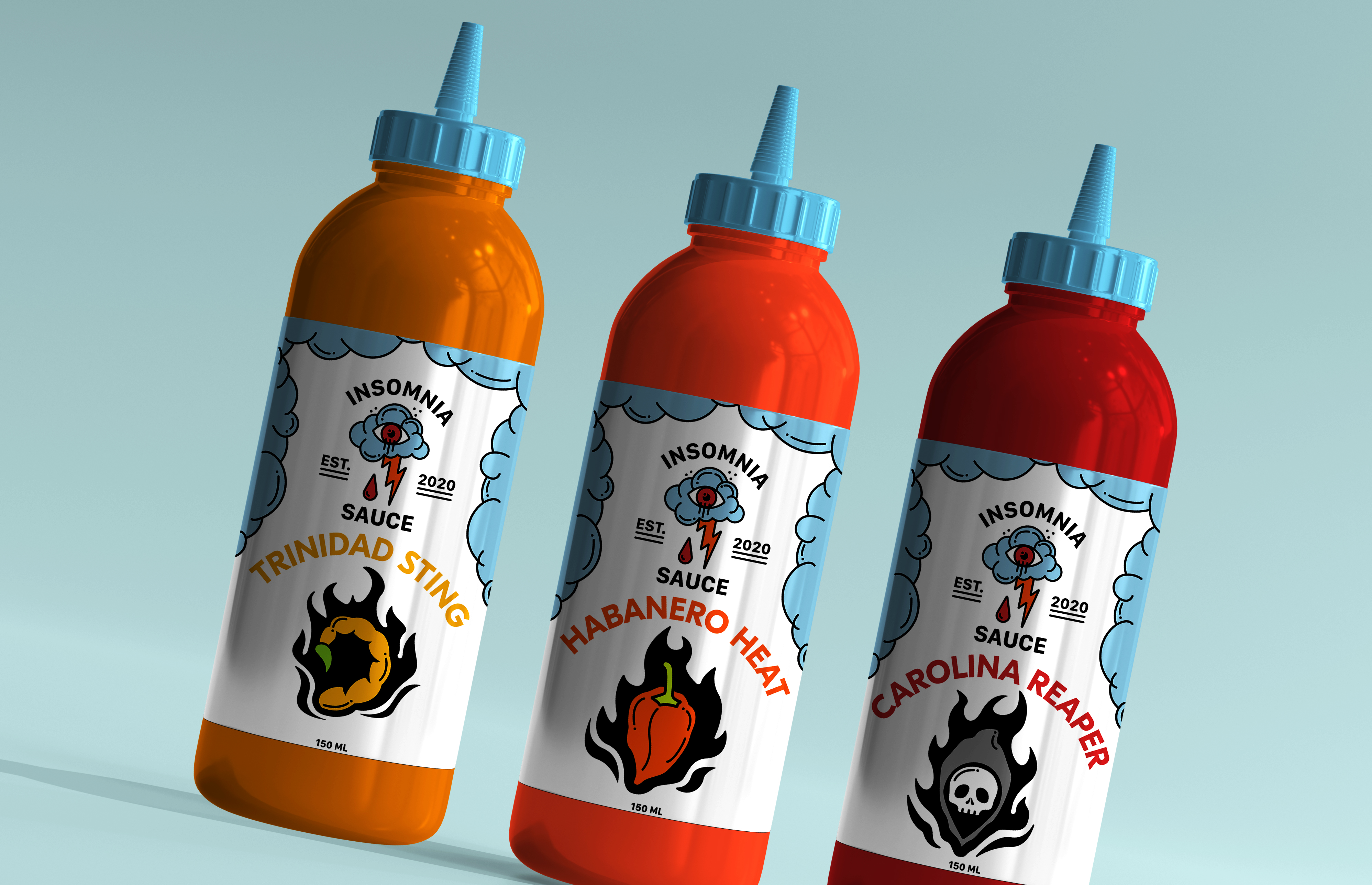
The design language combined expressive typography with sharp, graphic elements, all living within a unified layout system that kept the brand consistent across variations. This project pushed me to think like a brand strategist—ensuring that every choice, from color to type to illustration, worked together to build a memorable and functional identity.
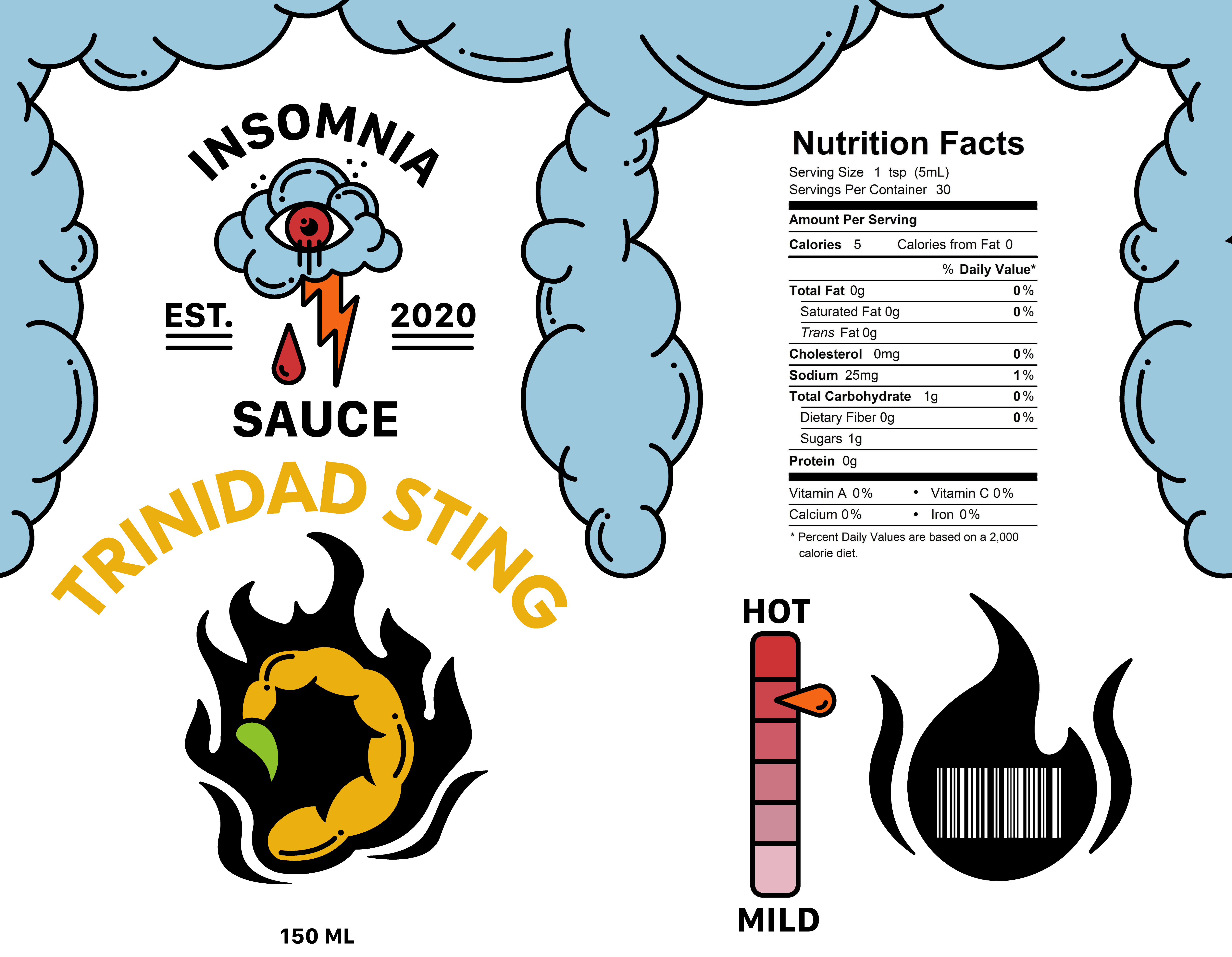
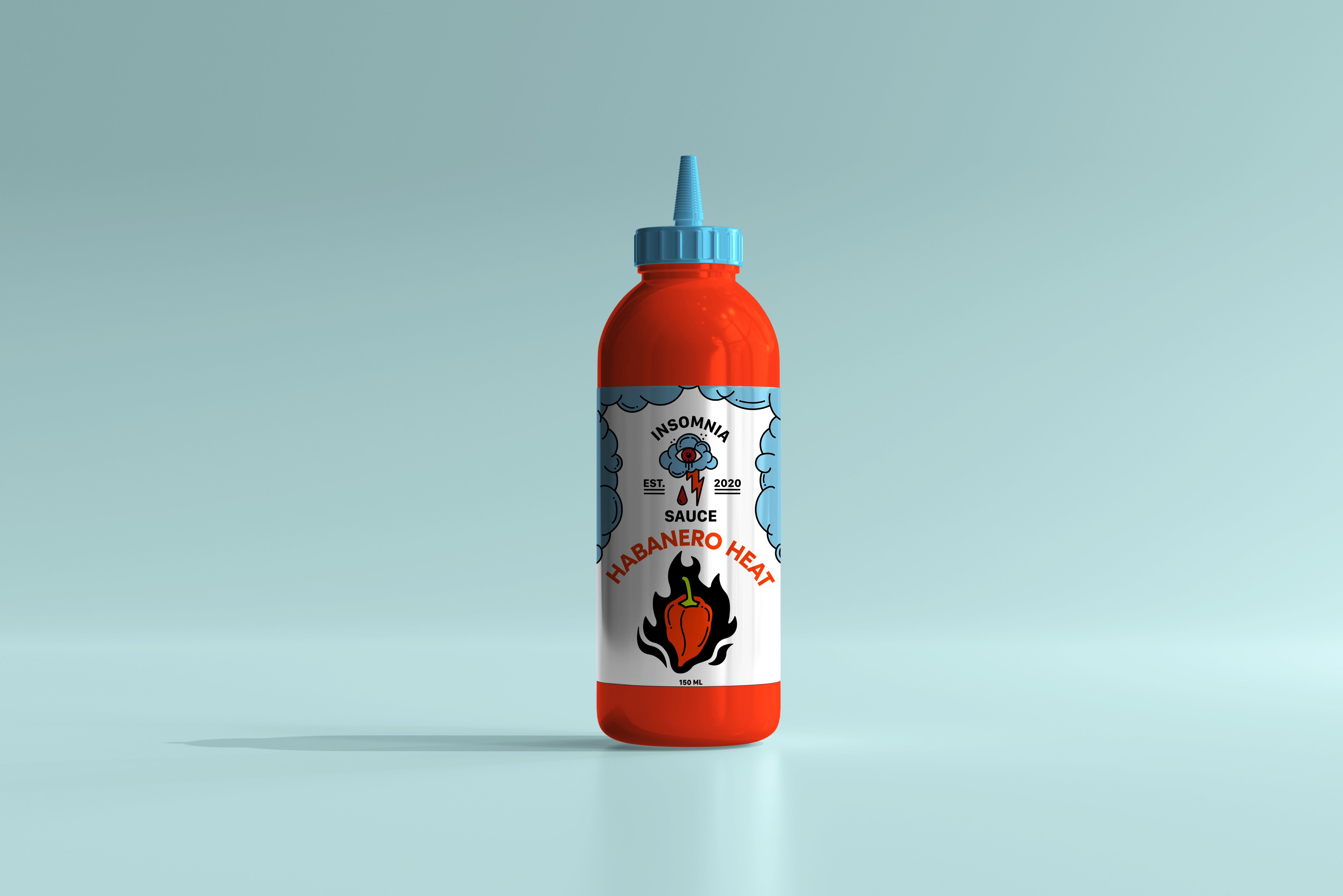
I treated each sauce flavor as its own personality, using the intensity of heat levels to inform the visual identity of each label. From mild to blazing hot, every bottle had a distinct look but still felt cohesive as part of the larger brand family. I used bold, high-contrast color palettes to convey flavor profiles and emotional tone—cooler hues for the milder sauces and progressively warmer, more aggressive tones for the hotter blends. This color hierarchy helped reinforce not only the spice level but also the experience the consumer might expect.

