I had the opportunity to create the brand identity for Trade Floor, a group dedicated to educating beginners about the stock market through guidance, tips, and strategies. The design process focused on capturing the essence of finance and growth while maintaining an approachable and modern aesthetic. Balancing professionalism with accessibility, I developed a visual identity that reflected the group’s mission of making the complexities of trading more understandable for newcomers.
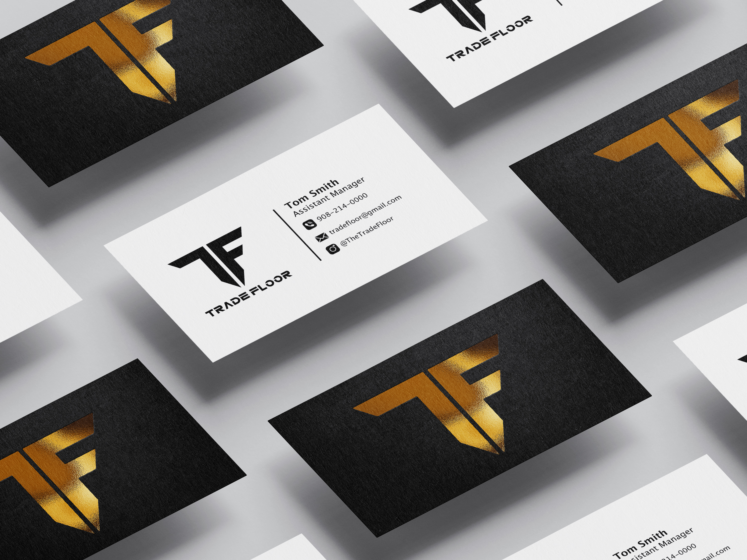
Both digital and print media played essential roles in TradeFloor’s branding campaign, so creating intentional distinctions between the two was vital. The print materials—such as business cards, flyers, and garment designs—needed to be crisp, concise, and immediately professional, ensuring the brand made a strong impression in person. In contrast, the digital assets allowed for more creativity and flexibility. These included social graphics, animations, and web visuals that were designed to be playful, bold, and visually engaging, helping to capture the attention of a younger, online-savvy audience. Balancing these two approaches ensured that the brand felt cohesive yet appropriately adapted for each medium.
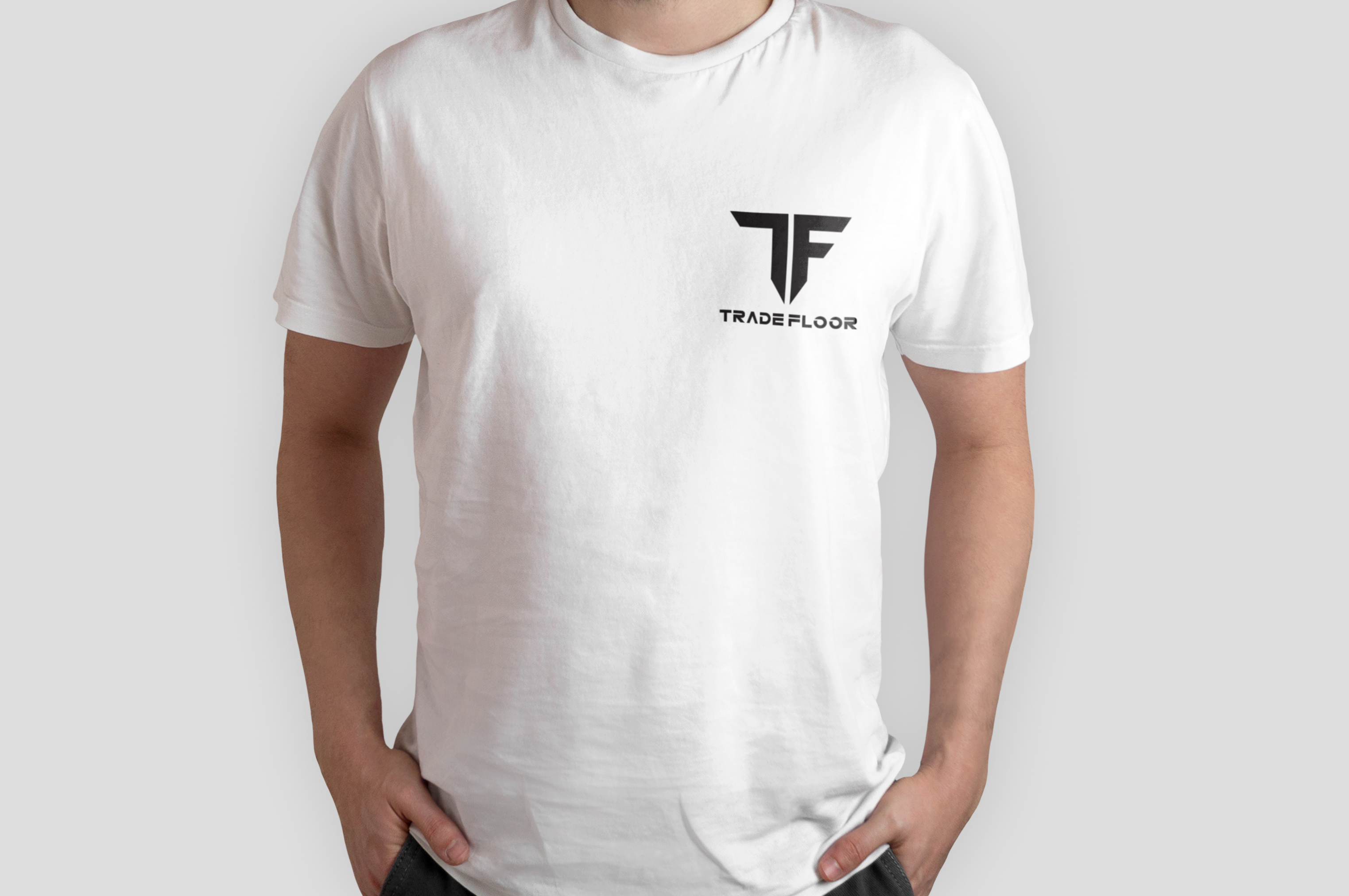
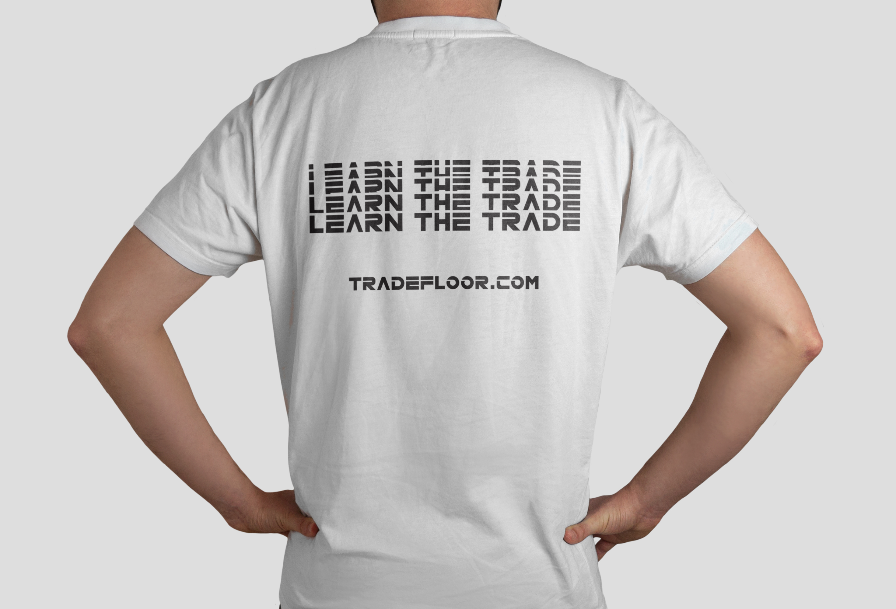
In designing garments for TradeFloor, I focused heavily on typography and style direction to align with the brand’s forward-thinking mission and youthful target audience. Font choice was especially critical—we wanted something with a futuristic, cyberpunk-inspired aesthetic that communicated innovation and a constant eye on the future. I explored typefaces with sharp angles and high-tech appeal, refining them to ensure they remained legible while still feeling dynamic. This approach worked particularly well for back-of-shirt designs, where bold, statement typography could make a visual impact. The style resonated with younger audiences, helping the brand feel current, aspirational, and visually distinct in a crowded market.