Designing for the Warren Local Fire Department was an absolute honor. When they reached out to me to create a commemorative logo celebrating their years of dedicated service, I knew it had to be something special. Capturing the bravery, commitment, and history of their department in a single design was both a challenge and a privilege, and I took great care in crafting a logo that paid tribute to their legacy.
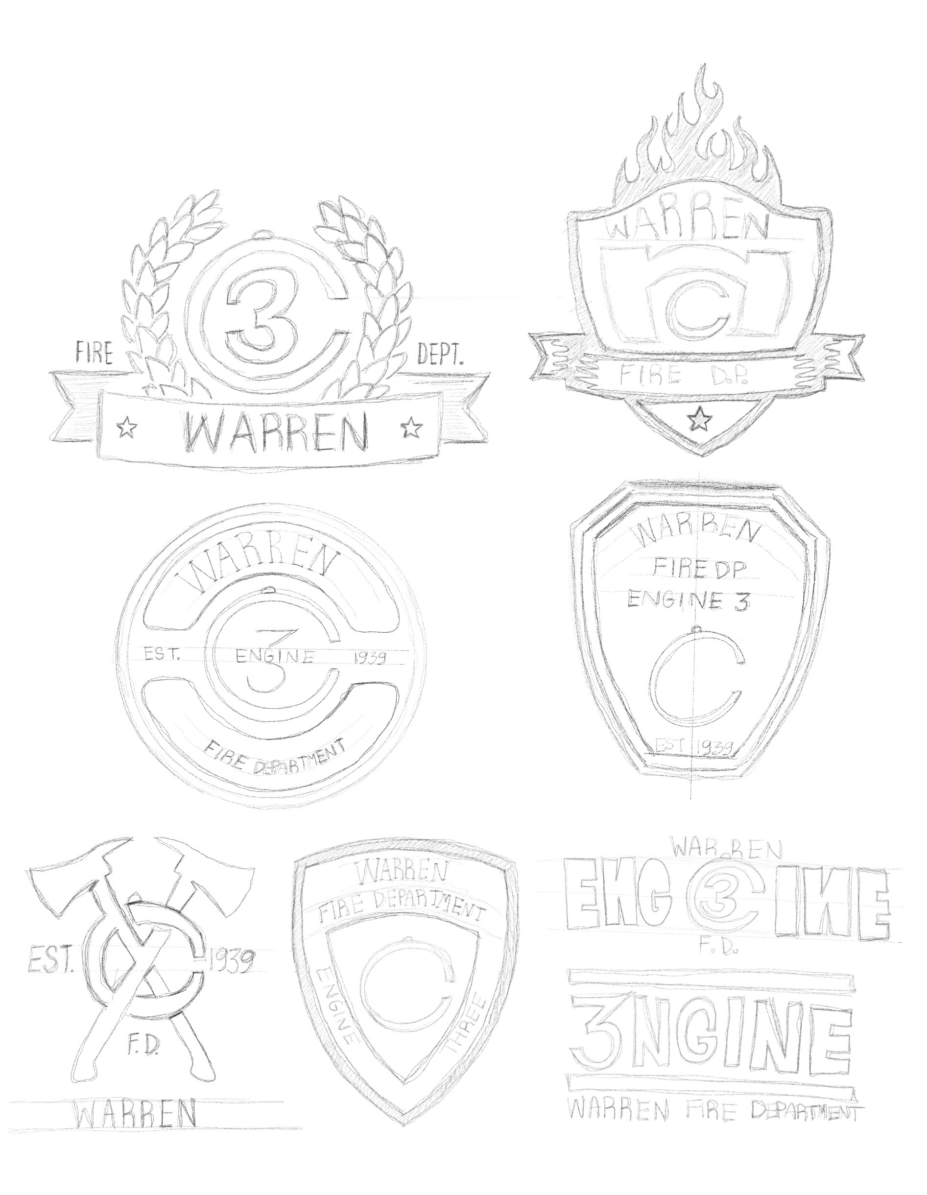
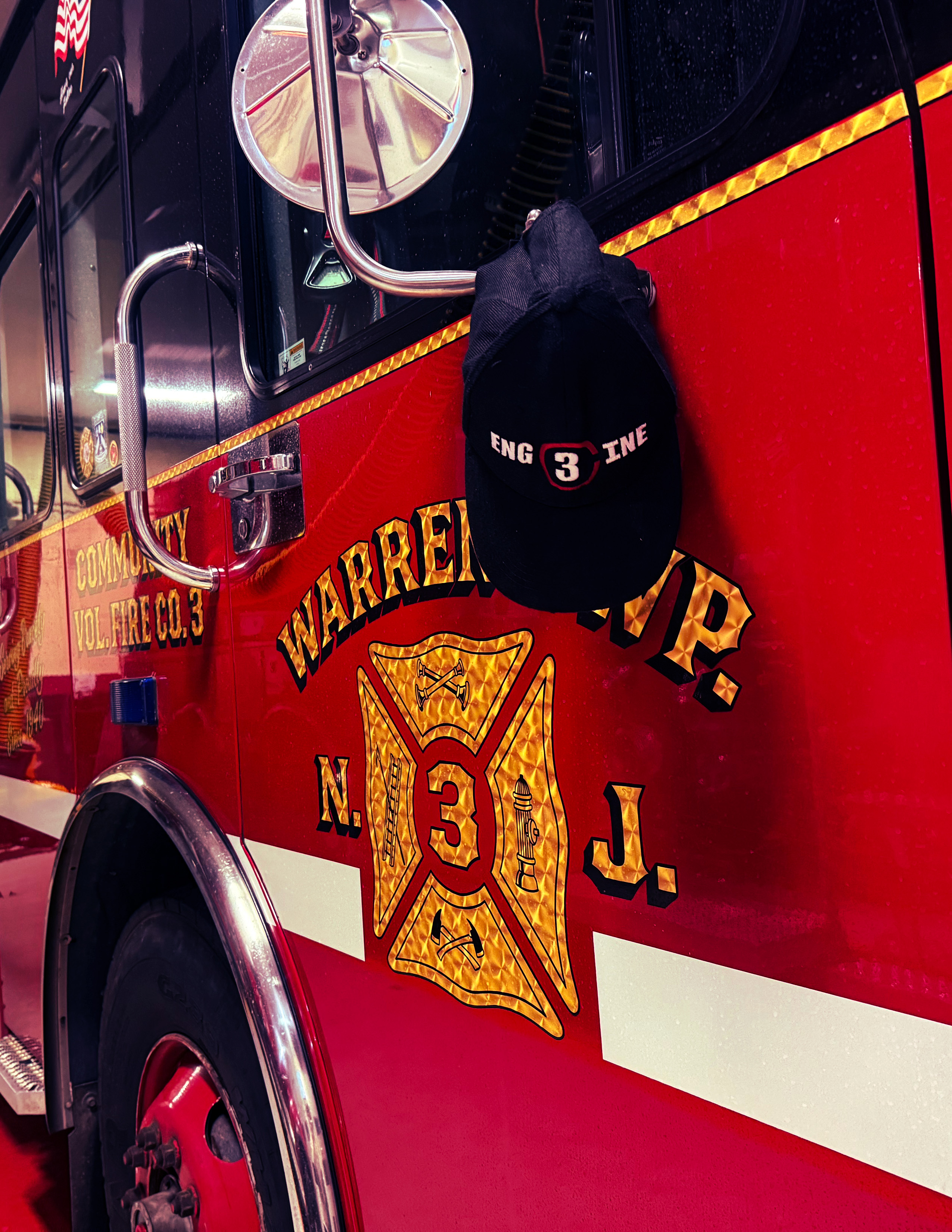
Eventually, I designed a logo that captured the modern touch the department was looking for. I incorporated the call bell’s shape into the design while seamlessly integrating the number 3 to represent their engine. The final design balanced tradition with a fresh, distinctive look.
The department was thrilled with the result and appreciated how the logo honored their history while standing out. They also enjoyed the creative process, valuing the collaboration and evolution of the design.
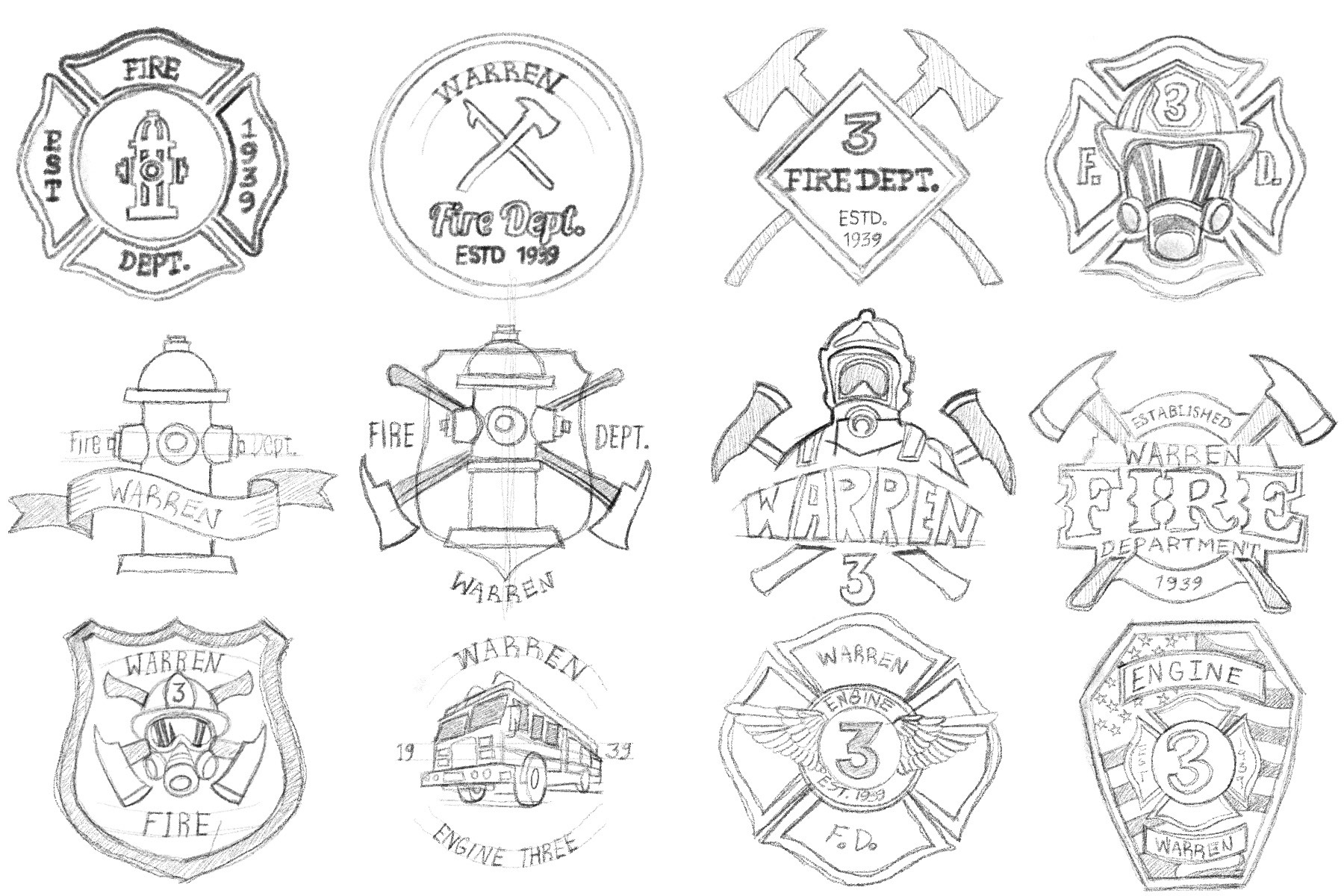
The design process began with preliminary sketches inspired by traditional fire department patches, using Maltese crosses and badge-like shapes. Through critiques with department members and the chief, it became clear they wanted something more modern as well as unique to Warren. They also wished to have a more modern logo, one that was based purely on type.
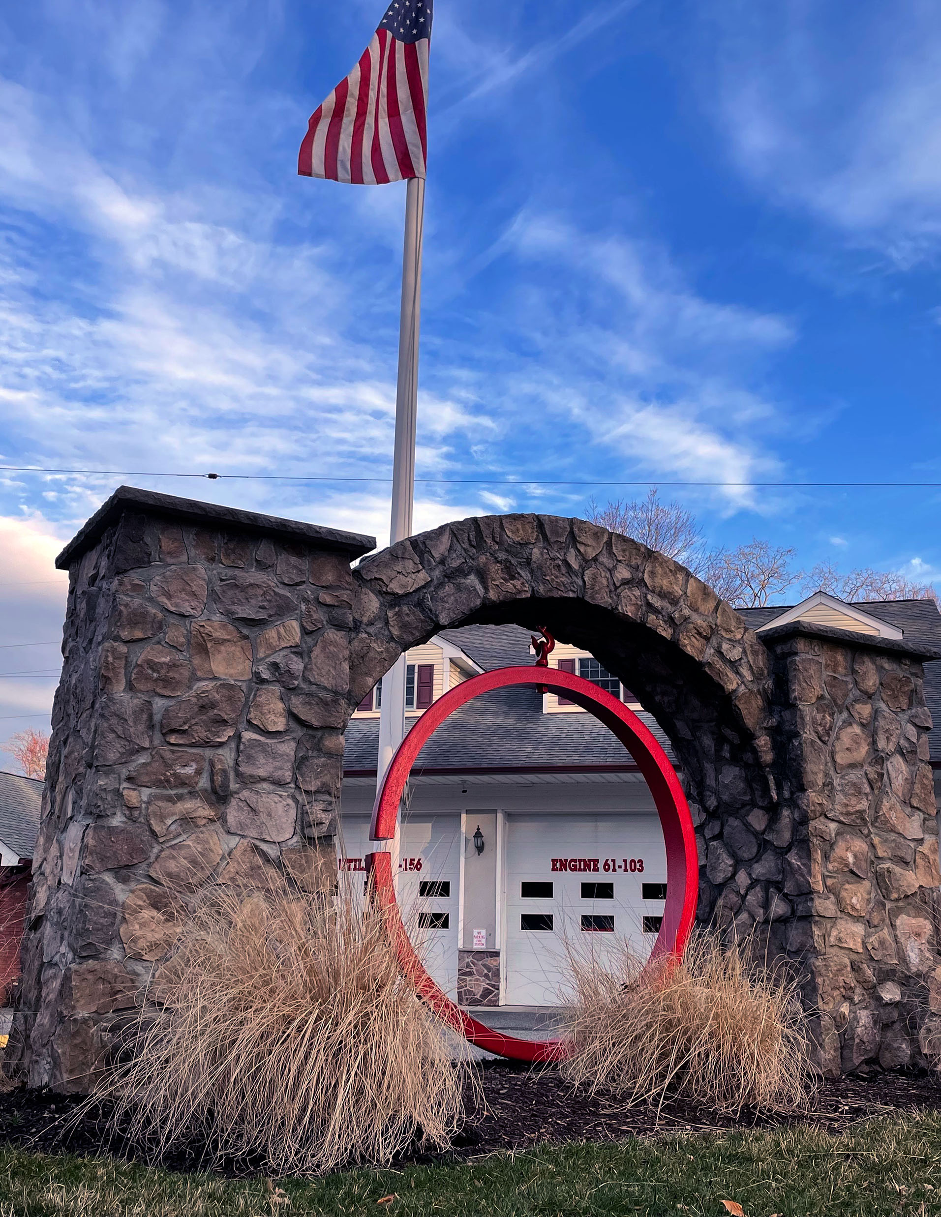
Looking for inspiration, I explored the station and became drawn to the old call bell out front—once used to alert the town of emergencies. Its circular form felt meaningful, so I incorporated it into the logo, blending history with a fresh, distinctive design.